
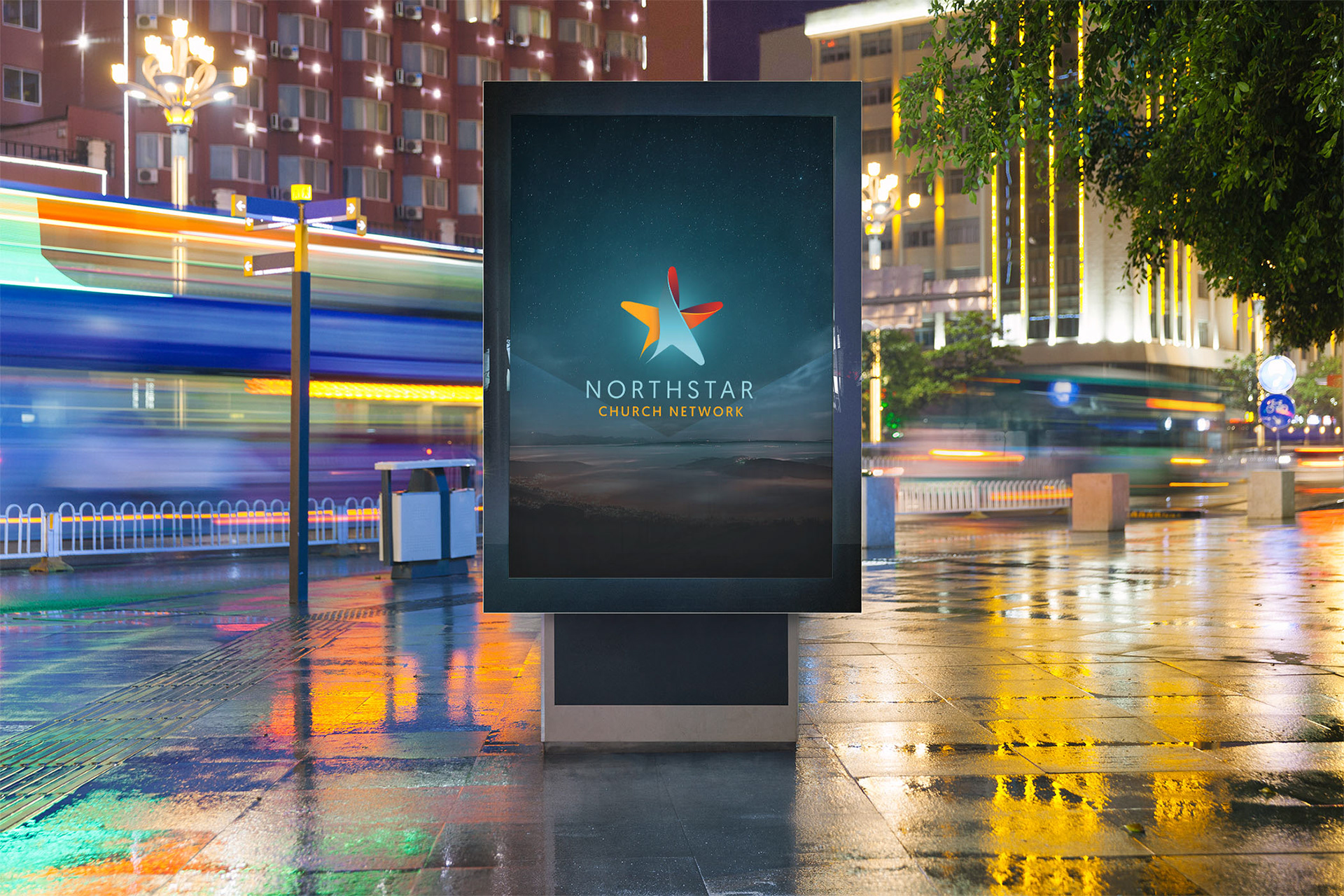
BRANDING
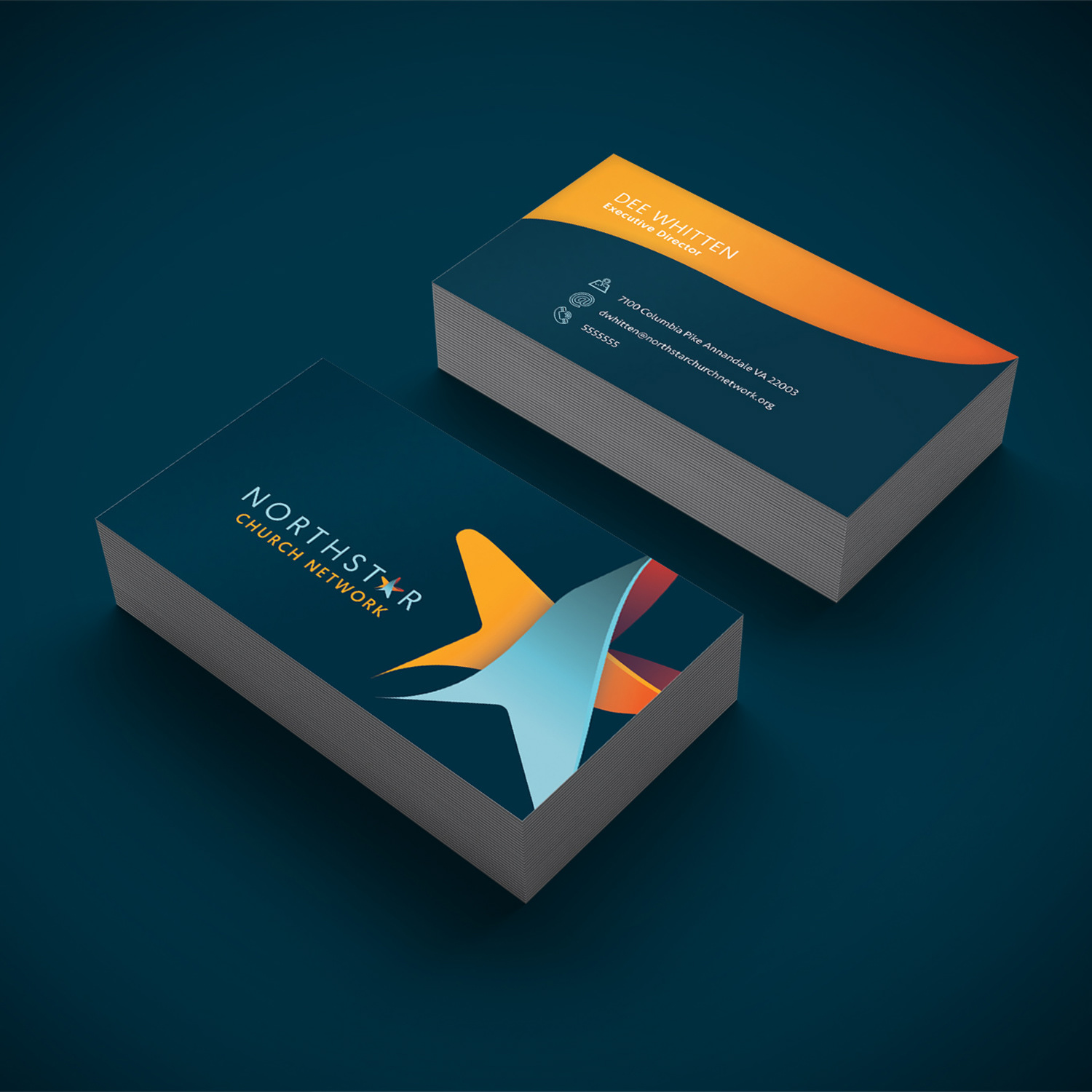
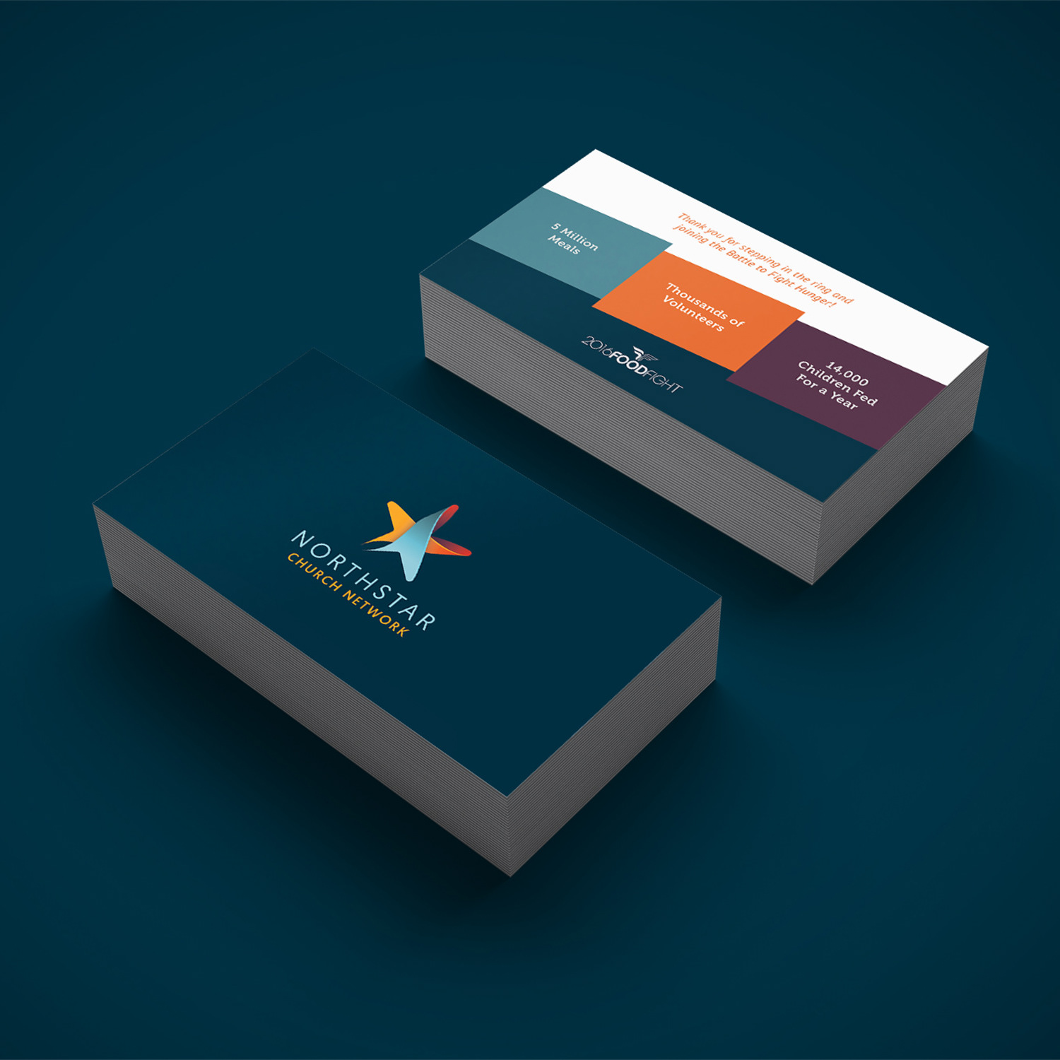
BUSINESS CARD
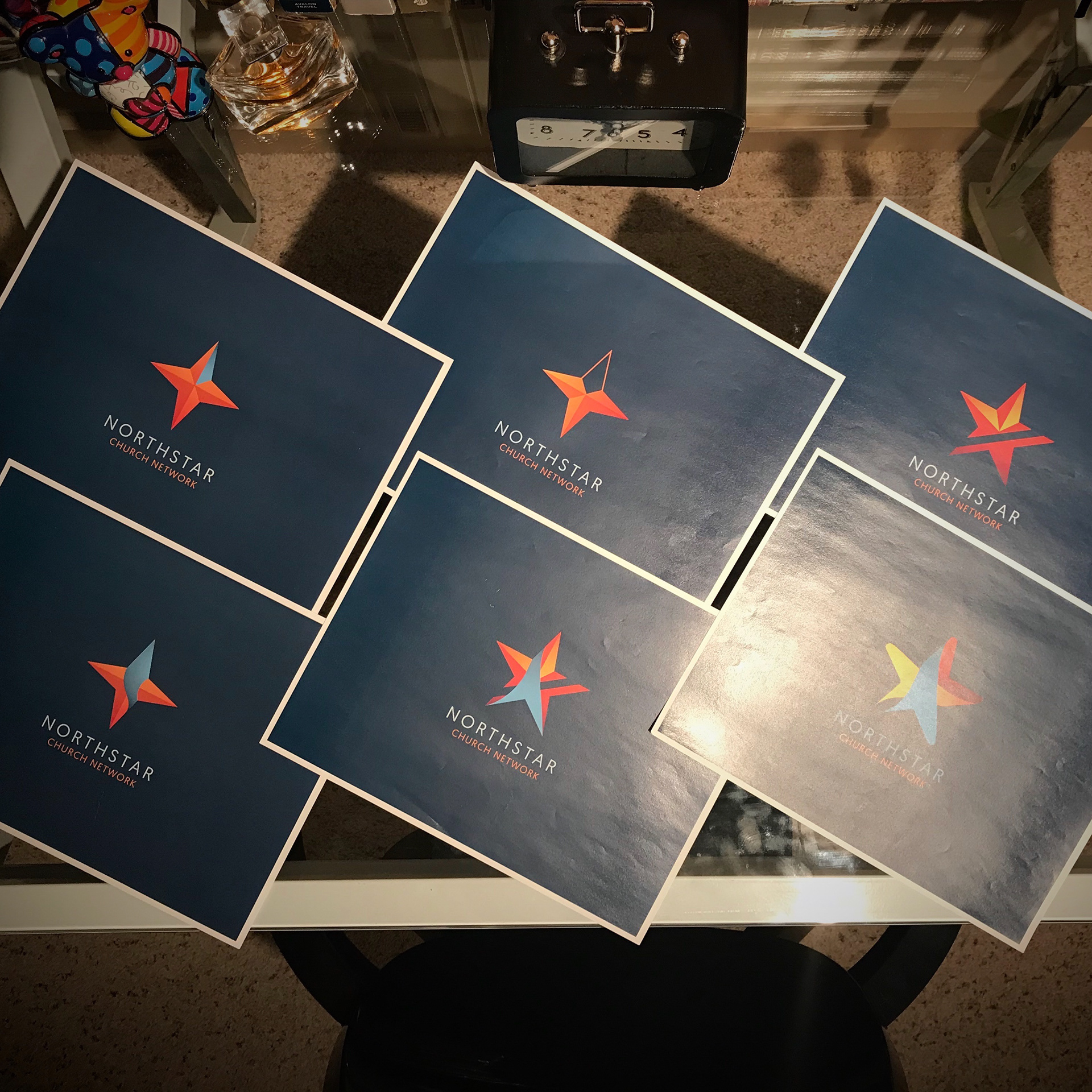
POSTCARD
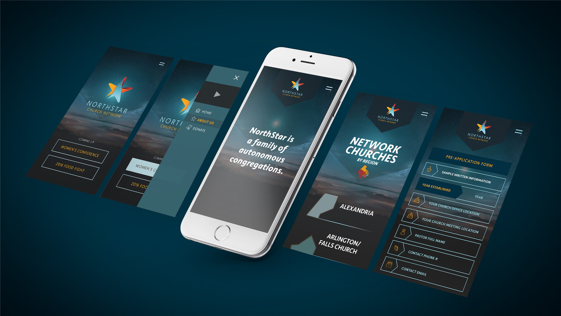
MOBILE UI DESIGN
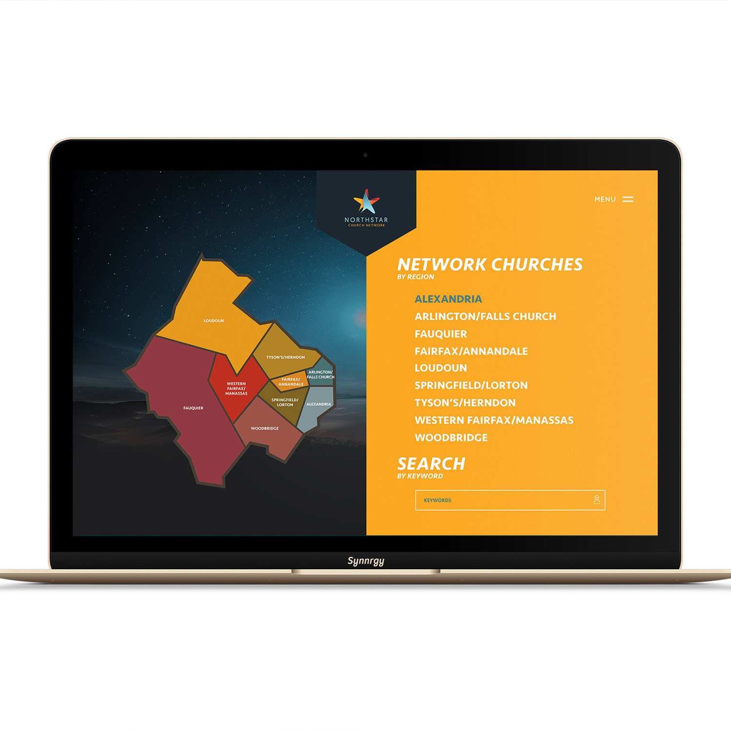
DESKTOP UI - Network Churches A Page
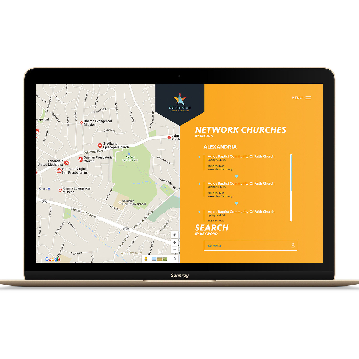
DESKTOP UI - Network Churches B Page
FACEBOOK COVER
Throughout the project, I collaborated closely with the client to ensure that the new branding accurately reflected their values and goals. I provided multiple design options and incorporated feedback to ensure the final product met their expectations.
This project reinforced for me the importance of developing comprehensive branding that not only looks good, but also accurately reflects the values and goals of the organization.
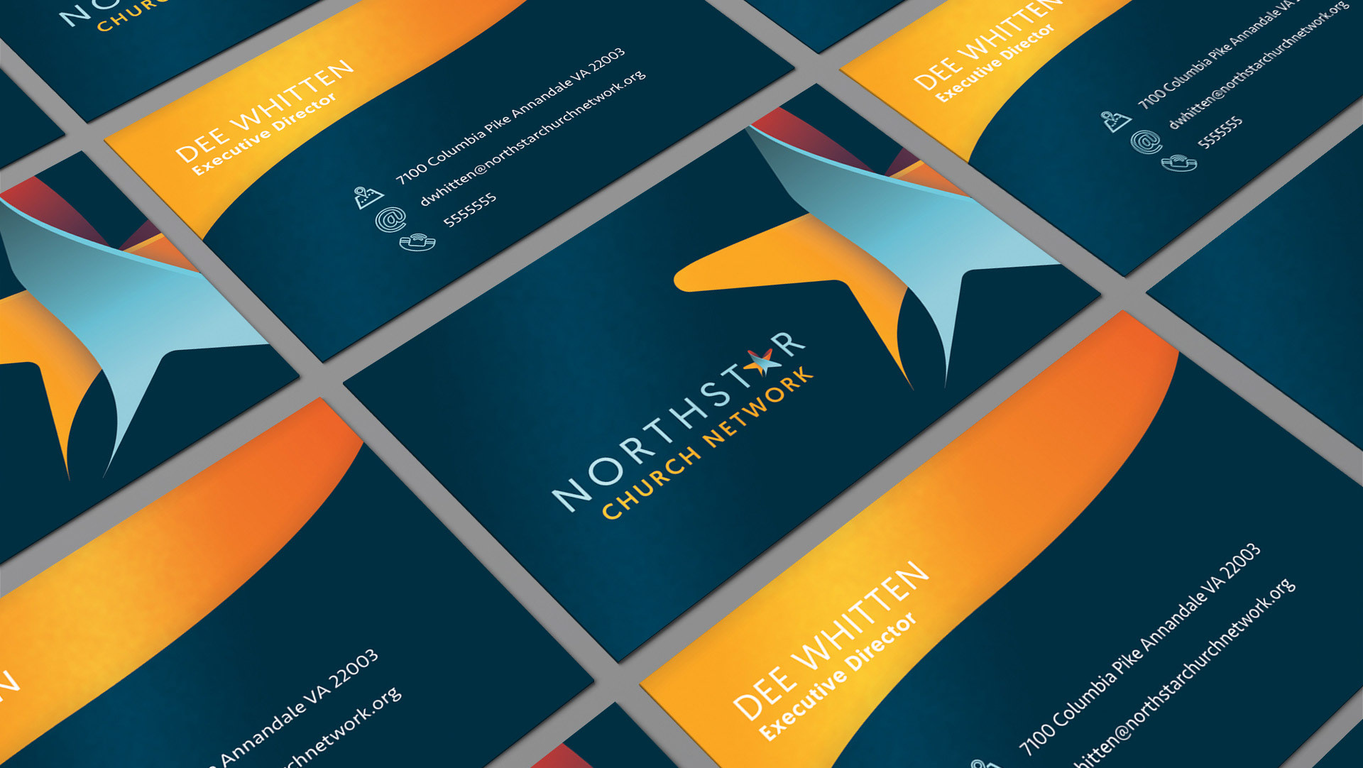
BUSINESS CARD DESIGN
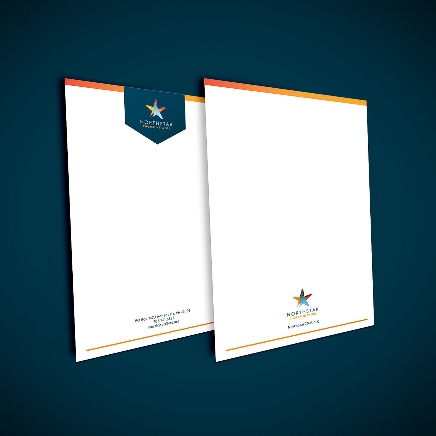
NOTEPAD & LETTERHEAD
TWITTER COVER
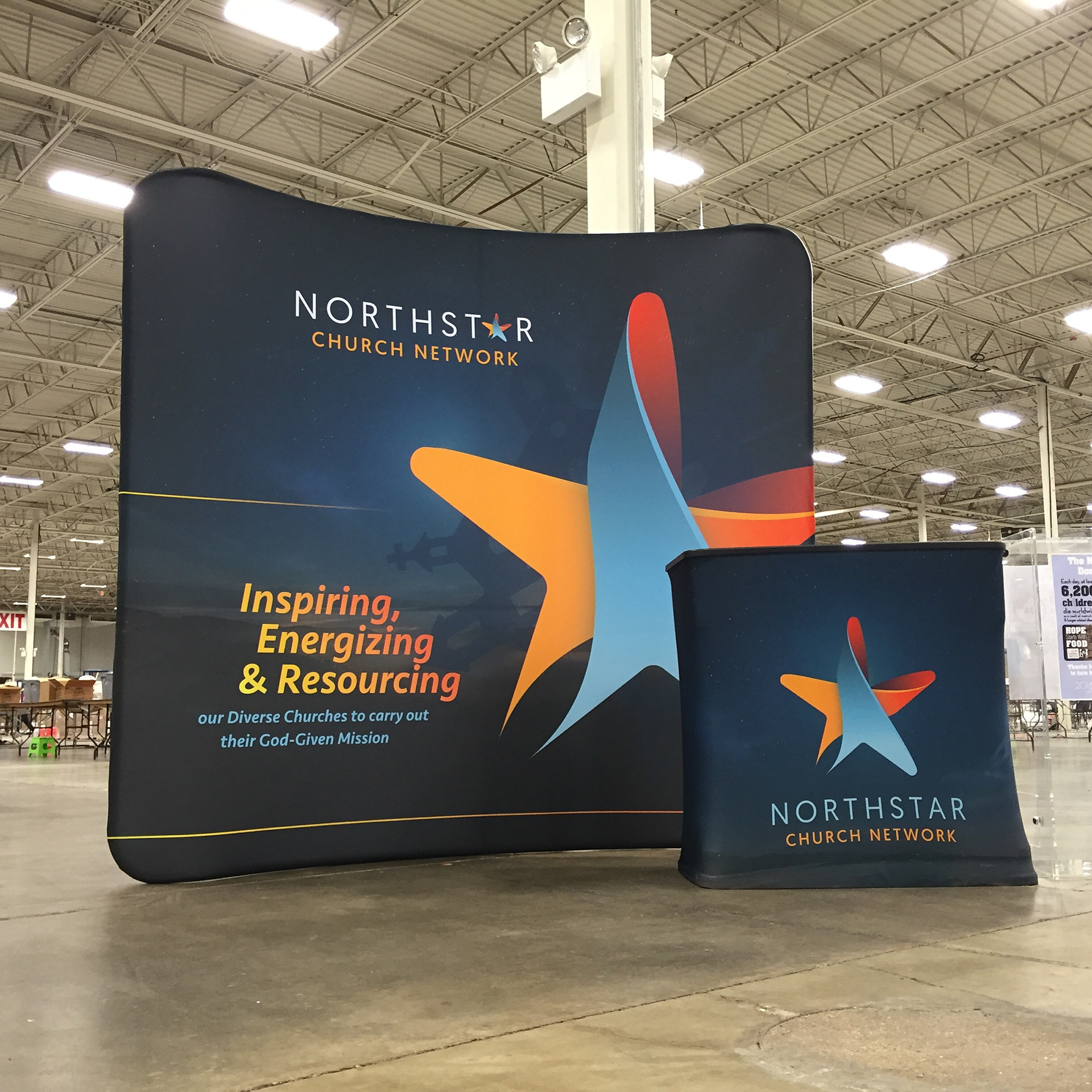
TRADESHOW DISPLAY & PODIUM
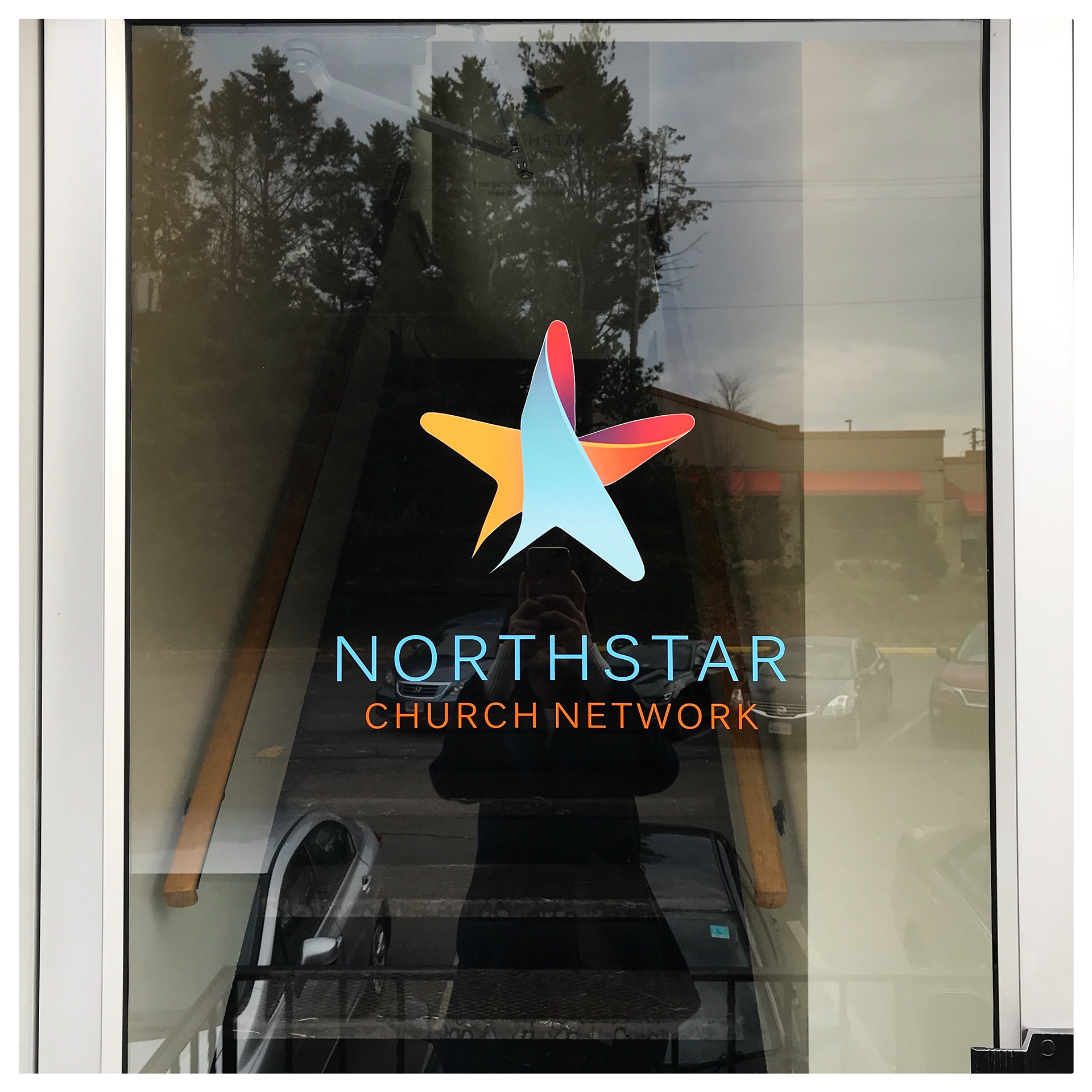
HEADQUARTERS
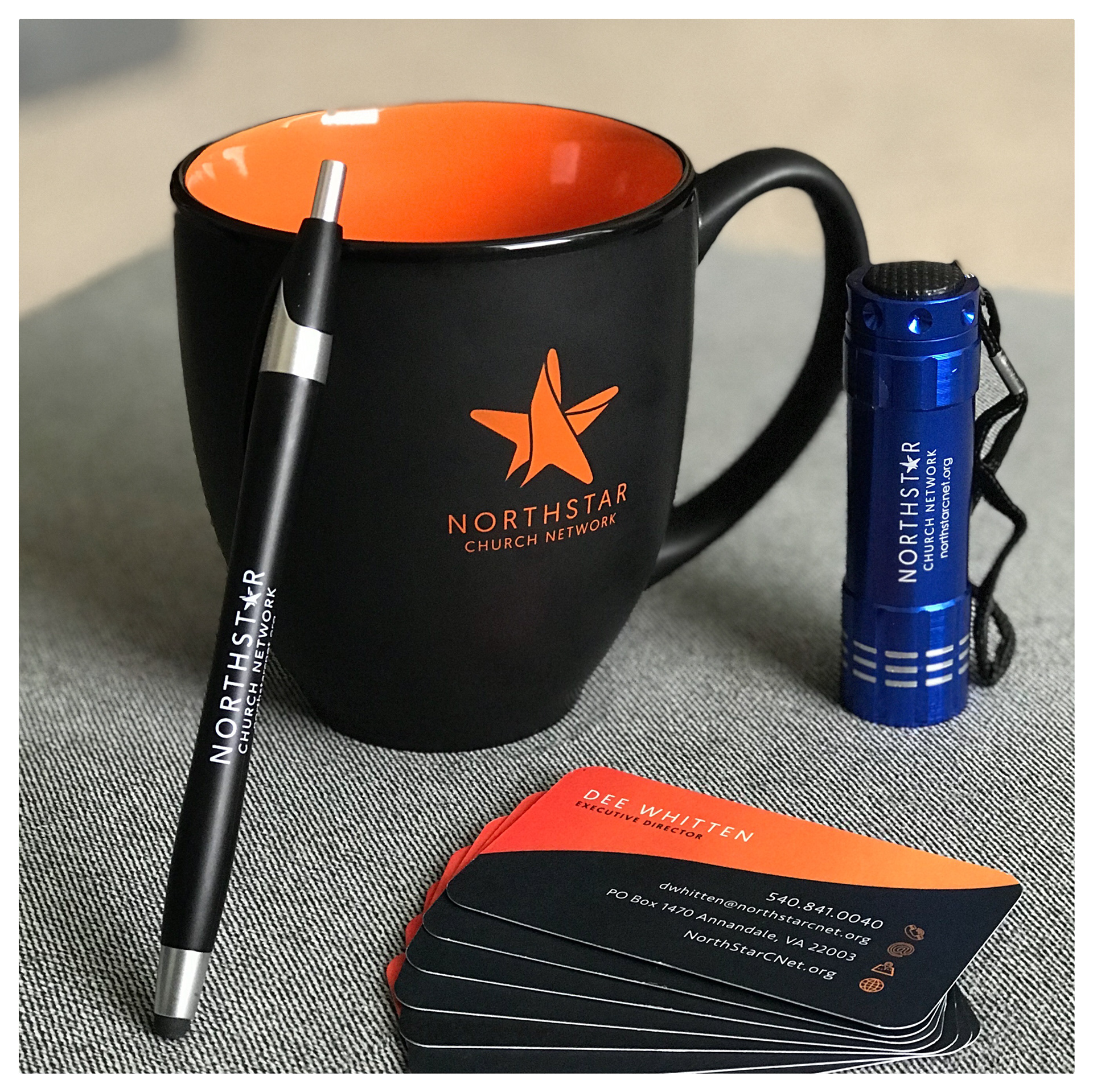
MERCH
The logo process
OUTDATED LOGO
BRAINSTORMING
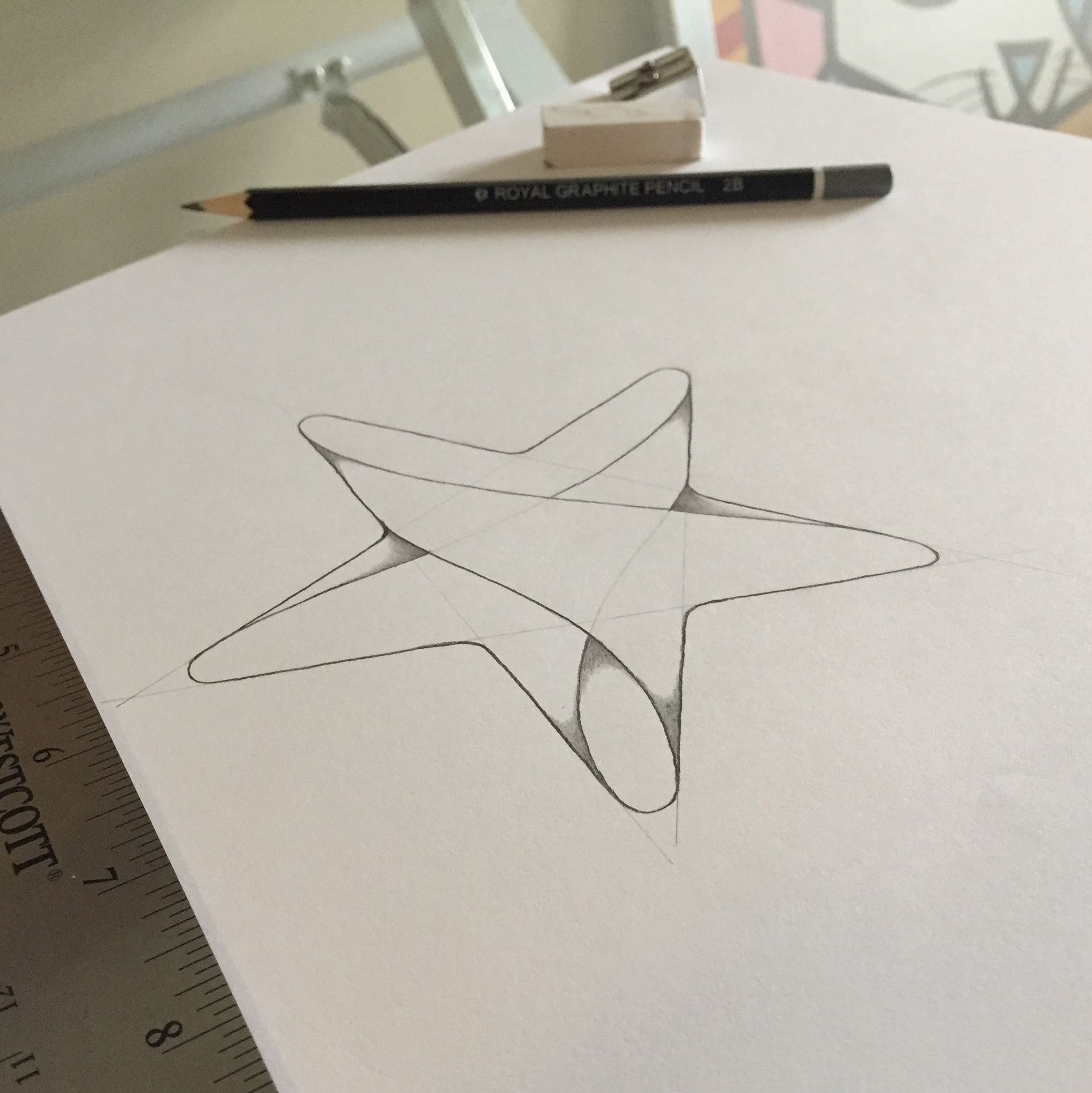
DETAILING

The process started with a the decision of three, four and five-point stars. With the consensus about the five-point star, the swaddle treatment was then chosen as the best symbol for the organization's primary mission of providing support to churches in their individual journey.
As a representation of diversity, the multiple colors chosen for the logo ensured the organization establish a connection with different types of churches and people. NorthStar Church Network aims to be an umbrella for all.
The saturation of the colors was the perfect choice to represent their desire to be a shining beacon of guidance among the community, and created the perfect contrast for this logo to be placed on darker backgrounds that resemble a night sky.


